Drawing music

This week our violinist model, Tim, will fill the space with music and energy. The idea that an artwork could capture such an energy originated with the Italian Futurist movement in the early 20th century. Giacomo Balla experimented with this in ‘Rhythm of the Violinist’. The staggered repetition of shapes gives the impression that the hand is moving through space and time, while the short, sharp strokes convey a sense of musical vibration.

Giacomo Balla, Rhythm of the violinist, 1912

Giacomo Balla, Rhythm of the violinist, 1912

Balla’s depiction of the mechanical action of the violinist’s hand bears something in common with Marc Chagall’s puppet-like ‘Green Violinist’. He makes a feature of the wooden-looking figure, formed by a collage of angular shapes in a nod to cubism. Chagall favoured magical symbolism over realistic representation, which explains why the musician is dancing, suspended over the rooftops of a miniature village. The symbolism stems from Chagall’s upbringing in the Jewish community in Russia, where the fiddler was a vital presence in ceremonies and festivals, due to the belief that it was possible to achieve communion with God through music and dance.

Marc Chagall, ‘The Green Violinist’, 1923-24

Marc Chagall, ‘The Green Violinist’, 1923-24

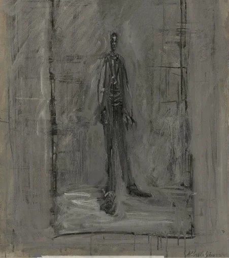
Our own model Tim has been deftly sketched in action along with the other members of the band S I N K, by the wonderful artist that is Alan McGowan. The figures strike a harmony of tensions between definition and elusiveness, a creative answer to the perpetual question of how to capture a living, moving subject in a static medium.

Alan McGowan, S I N K, 2017

Alan McGowan, S I N K, 2017

Hands/feet

After the face, hands and feet are the most expressive parts of the body. It may be tempting to shy away from drawing hands and feet as they present a technical challenge, but when their gesture is successfully captured, they are what gives a drawing its emotional power.


There is an infinite number of shapes a hand can make. Henry Moore made many drawings of his own hands in different configurations. He was interested in the hand’s ability to convey the emotions and the age of their owner, emphasised by directional shading. By letting go of the preconceived image of a hand, he was able to view them as simplified abstract shapes, leading to a more accurate drawing. It is rather ‘handy’ that we are able to draw our own hands and feet, offering a chance to become more acquainted with the forms before being faced with a life model in timed poses.

Whilst studying the hands and feet in isolation has many benefits, it is important to see them in integration with the rest of the figure, not glued on at the end! This helps keep proportions in check, demonstrated superbly by Euan Uglow. In many of his paintings the hands and feet are coming out towards the viewer, and scale is adjusted according to perspective, meaning that in this example one foot appears much larger and lower down in the picture than the other. Uglow uses the placement of feet firmly on the ground to situate the figure in space and give it weight.

Euan Uglow, The Quarry Pignano, 1979.

Euan Uglow, The Quarry Pignano, 1979.

Egon Shiele takes a much looser approach to drawing hands and feet, exaggerating the gestures of his models through a strong line. The hands and feet of his nudes are not conventionally elegant but bony and spatulate. He depicts every articulation for maximum expression, embracing distortion literally from ‘head to toe’. It goes to show that drawings of hands and feet need not have perfect anatomical accuracy - but simply be executed with confidence!

Egon Schiele, Mime van Osen with crossed arms, 1910.

Egon Schiele, Mime van Osen with crossed arms, 1910.

Scale/perspective

Scale is always relative in a drawing –  we rarely draw ‘to scale’. When reading an image, we rely on objects of known size to tell us how close we are. As we know, the further away something is, the smaller we should draw it, due to the laws of perspective. However these conventions can be manipulated in art, to fool the eye and create surreal compositions.


One artist who has played with this idea is Jean-Francois Fourtou in his 2007 series of sculpture and photographs ‘Mes Maisons’. We tend to judge the size of an object by the its relationship to the proportions of the body. As we grow, objects which appeared large to us as children may seem to have shrunk. Fourtou’s series is based on this sensation of the changing scale of his childhood bedroom. By creating a composition of everyday objects in miniature, he gives the impression that the figure is a giant, in an Alice in Wonderland scenario. Our eye is unable to determine whether it is the figure or the objects which are altered in size.

Miniature objects have the ability to draw us in or make us feel clumsy, whereas enlarged objects can overwhelm us and make us feel small. Marc Quinn makes sculptures of natural objects blown up to huge proportions, including five stainless steel shells. He used a 3d printer to create models of real shells before casting them. Model Natalie white posed nude within these sculptures, and the effect is a beautiful yet alarming sense of the vulnerability of the human body against nature.

Marc Quinn, ‘The Archaeology of Art’, 2011

Marc Quinn, ‘The Archaeology of Art’, 2011

Whilst these artists created elaborate sculptural pieces in order to alter our perception of scale, it is possible to achieve the same effect by much simpler means- a camera phone! Anyone who has visited the leaning tower of Pisa will be aware of the technique by which the image is flattened and objects in the foreground and background merge. By placing small objects closer to the lens, we can make them appear much larger in relation to the objects in the background, beautifully demonstrated by Kat to create the illusion of a flower-tutu.

Kat, 2017

Kat, 2017

These principles can be translated into life drawing – using careful placement of objects in relation to the figure, we can grow or shrink our model as desired!


Giacometti

Alberto Giacometti was a Swiss painter and Sculptor of the 20th century, whose striking, skinny figures are instantly recognisable. His career was characterised by obsession -  He worked from the same studio for over 40 years, and could never be satisfied that a work was finished.

‘L’Homme qui marche I’ is one of Giacometti’s typical spindly figures who looks like he’s stepped straight out of a Tim Burton film. But there is a logic behind this extreme body shape. Giacometti was interested in the idea that it is impossible to view an object independently from the space that separates you from it. He aimed to accurately depict the impression of a body at a distance, disintegrating into the space that surrounds it, and reduced to its core like a tree that has lost its leaves. This tension between mass and space was a continuous subject of exploration in his work.

‘L’Homme qui Marche I’, 1961 Fun Fact: In 2010,’ this sculpture became one of the most expensive to ever be sold at auction, and currently appears on the 100 Swiss Franc banknote.

L’Homme qui Marche I’, 1961
Fun Fact: In 2010,’ this sculpture became one of the most expensive to ever be sold at auction, and currently appears on the 100 Swiss Franc banknote.

Many artists struggled to depict the subject of the human figure after the war. Giacometti had found an alternative to the anatomical or representational. His skeletal figures became associated with existentialist ideas and a sense of post-war trauma, as they seemed to epitomise the feelings of human exhaustion and guilt - easily understood when looking at works such as the monochromatic painting ‘Homme Debout’. The same spatial principles can be seen in this painting as his sculptural work.

‘Homme Debout’, 1950

Homme Debout’, 1950

Giacometti did not exclusively work with the distant, skinny figure. He made many portraits too - whether from far away, or sitting close to his subject. He preferred to use models who he knew personally, which meant that his brother Diego was a recurring subject. Fascinated by the idea that life lies within the eyes, he concentrated on the sitter’s gaze, working all the other brushstrokes around this central point with a continuous scrutiny of his model. The results may not be flattering but there’s no denying their intensity.

’Head of Diego’, 1961

Head of Diego’, 1961

Cubist forms

Following on from the ‘paper shroud’ session, this week our model will be posing against piece of giant origami. This will create a backdrop of geometric shapes and dramatically lit planes. Inspiration for drawing the figure within such a structure may be taken from artists working in styles derived from cubism.

Picasso was one of the pioneers of cubism. In the early years, he constructed his images using small facets, or geometric planes, like those in origami. ‘Figure dans un fauteuil’ is one of his paintings in this style. Not only is the background broken up into geometric planes, but the figure is too. She appears mechanistic, and as if she is being engulfed by the shapes of the background, where you can only just make out an armchair. Despite this semi-abstraction, the tonal variation of the planes suggests the direction of the light and three-dimensionality. 

Picasso, Figure dans un fauteuil, 1909

Picasso, Figure dans un fauteuil, 1909

Another early cubist painting is Jean Metzinger’s ‘Deux Nus’. The models are portrayed from multiple view-points and at successive intervals in time shown simultaneously on the canvas. It results in a fragmented image of interlocking planes, which looks almost like a view in a broken mirror. The figures, the rocks and trees are all treated in the same way, blurring the distinction between background and foreground with only the colour variation helping to decipher the scene. Despite this, Metzinger still manages to render the nudes in a convincing and elegant way.

Jean Metzinger, Deux Nus, 1911

Jean Metzinger, Deux Nus, 1911

Wyndham Lewis was one of the artists involved in the development of Vorticism in England, a movement which owed a debt to  French cubism and Italian futurism. Like Picasso’s cubist painting, Lewis’s ‘Figure composition’ depicts fragmented space using sharp angles. Line thickness is varied in order to make things recede or project. The straight lines in the background and the sweeping curves that make up the figures come together to evoke the architectural and mechanistic rhythm of urban life, as they walk their bulldogs. In a similar way, a background of origami could be treated like a scaled-down architectural form.

Wyndham Lewis, Figure Composition (Man and woman with two bulldogs) 1912-13

Wyndham Lewis, Figure Composition (Man and woman with two bulldogs) 1912-13

These three artists demonstrate how the figure can be drawn against a background of geometric planes, in order to blend in or stand out to varying degrees.